I create designs and build interactive prototypes, sometimes wickedly complex with high enough fidelity to be used for usability studies, that show exactly how the design works and facilitate a rapid, agile iterative approach. I focus on interaction behaviors in leveraging prototypes for the most benefit with clients and development teams to work through use case scenarios, making sure the design meets the needs of the user and meets the goals of the business.
Design and A|B Test
Challenge
Industry research suggested the potential for higher conversion of travel insurance, so the challenge was to redesign a text-heavy checkout module to clearly communicate key benefits, be more scannable, easier to compare options and make a decision.
My Role
I was the UX Designer, Researcher, Copywriter and A|B Test Designer on this project. I built an interactive wireframe prototype that illustrated behaviors and I created redlines for development.
Process
User research to better understand perceptions and concerns people have about travel insurance.
Analyze the legal insurance description, distill the key benefits, then simplify and transform them into a value-based list that is easy to scan.
Information re-design by reorganizing options into a side-by-side arrangement making it easy to compare key benefits. Iterate multiple times with product management and legal.
Coordinate an A|B test and establish measurement criteria. Analyze results.
Results
The new design increased insurance purchases by over 20% without negatively impacting trip conversion rate, resulting in a $6M increase in revenue in the first 12 months.
Online Store Checkout Interaction Design
Flow diagram: existing and new
sketch wireframe prototype
Challenge
Design an online store to consolidate separate checkout paths and present a variety of new products to Real Estate Agents in a consistent way. At the same time, provide a more compelling value proposition and a clear call to action while fundamentally changing the way the products work.
My Role
I was the UX Designer and Researcher on this project. I built an interactive wireframe prototype in Axure that illustrated various products and the flow for various combinations of use case scenarios (including discounts). I worked with a Visual Designer who supplied the icons. I designed, planned and conducted a usability study using a high-fidelity version of the prototype that I created. After delivery, I ran a usability study on the fully functional final product to verify that changes effectively resolved usability issues.
Process
The process began by creating a flow diagram to understand the intricacies and complexities of the existing purchase paths. I leveraged recent user research and an understanding of agent’s perspective on products in building a quick sketch wireframe prototype, using Axure, to explore alternative designs and behaviors for product pages and the shopping cart. The wireframe was eventually enhanced to a full-color, high-fidelity interactive prototype (incorporating new icons from Visual Design) used to demonstrate the complex use cases of the solution to executives and provide a detailed, annotated interaction spec to developers and QA. I then designed, planned and conducted a usability study using the prototype. Changes were incorporated based on the results of the study. After production delivery, I designed, planned and conducted a usability study on the fully functional final product and presented findings to executives.
Results
An updated, smooth checkout process that works consistently with all current products and is designed to accommodate new products. An online store that provides product detail and makes it easy to manage subscriptions and training all in one place, which increases user satisfaction and reduces support calls. The usability study showed that agents were successful with shopping and purchase tasks.
Lessons Learned
We learned that people searched for ZIP codes in ways we didn’t anticipate. Due to a compressed schedule we made a conscious decision to design to an 80% level of confidence and I learned to deal with my discomfort in delivering a design with limited time to think through all of the edge cases. A last-minute change in technology constraints fundamentally changed the way things worked and required a major shift in the design, which had to wait to be implemented until a later iteration. I learned that what appeared to be a simple sharing of data from page to page in the app proved to be far more technically challenging than expected because of the framework and technology we were working with, so the feature was scrapped.
Mobile Design

Challenge
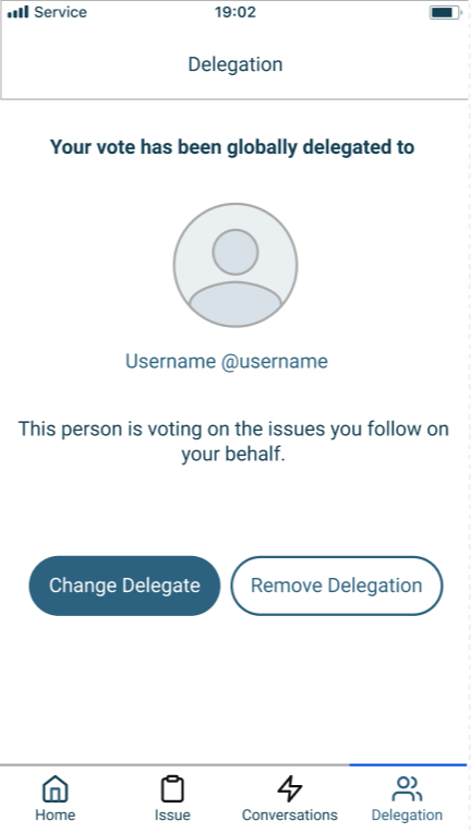
Design a mobile app to support the notion of delegated voting in liquid democracy with the goal of increasing community engagement and quick resolution of social issues.
My Role
I was the UX Architect, Designer and Researcher on this project and I worked closely with another UX Designer as we collaborated on this volunteer project. We were responsible for designing all of the screens, copy and graphics in building an interactive prototype using Figma.
Process
We started with informal research with friends and family on delegating their vote and explored various contexts (such as a school community or homeowner’s association).
We created wireframes of interface elements and an interactive prototype to show the flow of the app.
I conducted a user research study with an ad-hoc group that was tasked with addressing a social issue. I then conducted follow-up interviews with each participant after the study to learn about their experience with the app.
Results
A mobile app that people can use to become aware and involved in issues in the community and make their voice heard through voting and discussion much easier than attending meetings, in person, or submitting feedback that seemed to disappear into a black hole with local leadership.
Community leaders and reach decisions much quicker than traditionally.
Lessons Learned
I learned that the social context and relationships can have a significant impact on the experience of using an app. Participants in the ad-hoc group did not already know each other and were hesitant to create issues for the group to vote on because they were afraid their ideas wouldn’t be good enough. So, their fear created a barrier to interacting with the app.
Mobile Interaction Design


Challenge
Create a to-do and shopping list solution for people who value filtering the items in their list by category, associating items with multiple stores to make shopping easier and who want to re-use lists (packing for a trip, for example).
My Role
I was the UX Architect, Interaction Designer and Visual Designer on this project. I was responsible for designing the app to work effectively on both iOS and Android mobile devices as well as desktop displays. I originally used JustInMind to create an adaptive and responsive interactive prototype to show how each menu works and when a mobile device is rotated. I later created the design and prototype in Figma.
I adhered to a design driver of direct manipulation, so that people can edit text (names, and notes) inline, without having to open items in edit mode.
Process
I sketched out the key functionality in screens and menus and then built a wireframe prototype to exercise the functionality of the design and tested it both on mobile and desktop devices. I iterated, based on user testing, until reaching the final design.
I also documented interactions and behaviors (such as gestures, animation timing, transitions, etc.) for touch interfaces on desktop and mobile platforms.
I architected the solution to support filtering by Stores and Categories to make it easy to focus only on one area for what you need. I also designed the app to support items being associated with more than one store so that it appears in the list regardless of which store you are shopping at.
Results
A mobile application that fills a niche and meets the needs of people who value categorizing the items in their list and who want to re-use lists. It makes it easy to filter the list by category and to reset the list to be used again.
Lessons Learned
I learned that working out how the association with multiple stores would work had a significant impact on the architecture of the app and where, in the interface, stores could be viewed and changed in order to ensure the app is easy to use and self-explanatory.
Voice Interaction and Interface Design
Challenge
Design a voice solution for people who have solar systems so that they can get a quick update on how much energy the solar system is generating.
My Role
I was the voice Architect, Interaction and Interface Designer on this project. I was responsible for designing the intents, utterances, responses, and error handling.
Process
I started by roughing out the schema, including the standard, built-in intents for Stop, Cancel and Help and one custom intent to get information about how much energy the solar system is producing. I then listed out several possible utterances.
From there, I focused on mapping out the flow for handling situations where there is a problem with the [date] slot or an utterance is misheard.
The next step was to expand the conversation by offering supplemental messages with interesting factoids and comparisons based on how much electricity has been generated. For example, “That's unusually high for this time of year! I hope you enjoyed all that sunshine!” or “Your system has generated enough electricity, so far this month, to charge an electric car 7 times”.
On to the visual part of the design, incorporating charts that can appear on Echo Show devices to display the energy the system is producing throughout the day, within the current week and within the current calendar year. Plus, at-a-glance tiles showing quick-reference information, such as the status of the system and the electricity generated for the day.
Results
A design for a voice UI that delivers relevant information about the energy the solar system is producing, as well as pertinent supplemental information, such as comparisons to historical data or interesting factoids to equate the numbers to something more tangible (such as charging a car or heating a bath).
The design also incorporates charts that can appear on Echo Show devices to display the energy the system is producing.
Mobile Interaction Design
Challenge
Design cross-platform app to engage younger customers and promote Frappuccino drinks by creating a connection between a drink builder and a whimsical sound remix app to encourage exploring drinks while waiting in line and then sharing with friends. Integrate with a tablet version to tie drinks and remixes together.
My Role
I was the UX Interaction Designer on this project. I worked with the creative lead, visual designer and developers to explore ideas and determine the concept, user flow and experience. I built an interactive wireframe prototype to explore design variations and define behaviors..
Process
I began by building an interactive wireframe prototype that walked you through creating your own custom drink then making it easy to share it on social media. I created design variations to explore alternatives for the visual soundboard and illustrate how the mobile app will support building your drink and showing your recipe to the Barista.
Results
An enhanced drink builder tied to a fun remix based on your drink and social media integration to make it easy to share, which doubled the number of logins to Facebook during the summer promotion.
Lessons Learned
We learned that the best way to support mobile, tablet and desktop in a short timeframe, and for a site with a lifespan of less than one year, was to go with a mobile web approach, rather than native apps.
Responsive and Adaptive Design
Challenge
Create a set of interface components, following atomic design, for desktop, laptop, tablet and mobile, to be used across an entire network of sites, in order to maintain a consistent and cohesive experience and effectively present information to people.
My Role
I was the UX Architect on this project and I worked closely with the UX Director (who focused on navigation), a Business Analyst and a Visual Designer. I was responsible for designing each component to work effectively on mobile devices as well as large desktop displays. I also decided how complex components (such as tabs, accordions and carousels) transform, appear and behave in mobile. I used OmniGraffle to create wireframes of interface components and several page layout templates in the new framework. I built an adaptive and responsive interactive prototype, using Axure, to show how each component would appear within each of the 5 breakpoints
Process
We did an inventory of components across several sites and synthesized that into a standard set of components that would meet the needs of the business for all the types of information.
We created wireframes of interface components, with configuration options, and several page layout templates. We built an adaptive and responsive interactive prototype to show how each component would appear within each of the 5 breakpoints.
We also created interaction design specs to document the interactions and behaviors (such as animation timing, hover states, transitions, etc.) of each component on both mouse and touch interfaces on desktop and mobile platforms.
Results
A framework of 16 simplified components and an interactive prototype showing how interactive components (such as tabs, accordions and carousels) appeared and behaved in various a layouts (from 1-column mobile to 12-column desktop).
Lessons Learned
I learned the true difference between responsive design (where components shrink/grow to the space available) and adaptive design (where components are transformed and behave differently for different form factors; mobile especially). I learned the value of patience in facilitating agreement, within a large organization, on the appropriate breakpoints to take us into the future. It was surprisingly challenging to build consensus on what devices needed to be supported, but it all settled out in the end.
(see the components in the interactive wireframe prototype respond and adapt as you change the size of the browser window between desktop (1200 px+) and mobile (320 px))
Design, Prototype and Usability Study
Challenge
Design new messaging interface to create a more familiar experience, incorporate new features and address usability issues.
My Role
I was the sole UX Designer and Researcher on this project. I was responsible for the design explorations, deciding on the alternatives, building the prototype and conducting the usability study. I built 3 interactive high-fidelity prototype models with complex logic and used them to observe common messaging tasks, in a usability study with agents, in order to determine which model worked best. I delivered interaction design specs to developers and QA that they used to build and test the solution. I also coordinated and managed the local development effort with the help of a remote Project Manager.
Process
I began by gathering feedback on pain points with the current interface and then continued with research into common messaging patterns. I settled on 3 models, including one similar to the existing interface, for a baseline and to see if agents preferred the interface they had grown accustomed to. Features of the models were driven by design principles, such as feedback and visibility. I built high-fidelity prototypes of the models and designed and ran a remote usability study with agents using each model. I gathered observational data and opinion data. I presented the findings and insights to executives along with a recommendation. The technical team then built and tested the solution.
Findings
After analyzing both quantitative observational data and qualitative opinion data, the model with both icons at the top and inline proved best.
Lessons Learned
This project was intended to be a ‘quick win’ and served as a good example of the value of using user research and prototypes to inform design decisions. I was required to conform to the existing style because messaging is just one part of the larger site and set of tools. The research into common messaging patterns proved convincing design rationale for executives. I needed to step into the role of managing the project locally in order to ensure it got done in a timely manner. Working closely with the dev and QA team helped clarify expectations and misunderstandings and ensure what was built met the design goals.
Prototype and Interaction Design
Challenge
Design a Guest Payment feature to simplify authentication requirements and permit customers to make one-time online payments, yet encourage them to register for an account.
My Role
I was the UX Interaction Designer on this project. I worked closely with the account manager to clarify the business needs and constraints plus capture use case scenarios for multiple account states. I used Axure to build an interactive wireframe prototype to explore alternative approaches. I partnered with a visual designer, who applied the style to the wireframes.
Process
We began by clarifying the business needs, goals and constraints and then capturing use case scenarios for multiple account states. I built an interactive wireframe prototype to explore some alternatives and define the user flow and experience.
We made the interactive prototype available to the client so they could work through each use case, in detail, and provide feedback online. We incorporated feedback as we iterated on the design.
We delivered an interaction design spec (which included annotated wireframes and defined the interaction, behavior and layout for the payment process), and visual design comps.
Results
A solution for a new capability to pay online as a guest that simplified authentication and worked well in all context scenarios. An approach that leveraged all the information entered for the guest payment to encourage people to take one more small step to create an account.
Lessons Learned
I learned that the edge cases, related to the many states an account can be in, took a significant amount of time and effort. Achieving a way to support the ‘Keep the Change!’ program in the interface, as an alternative to donating a fixed amount to the Energy Assistance Fund, required a few iterations